Champions of Design is a paperback book and free-to-download PDF published in December 2011 by Jones Knowles Ritchie (jkr).
"In this book we celebrate twenty-five great works of design, the people who created them and the clients who bought them."
Here's an excerpt, featuring on one of the 25 brands.

Penguin
Given its beloved status as a British institution to rival the BBC, it's worth remembering what a revolutionary idea Penguin originally was. The company's cheap but well-made, well-designed books found a new audience of working and middle-class readers that few believed existed. The future really was orange.
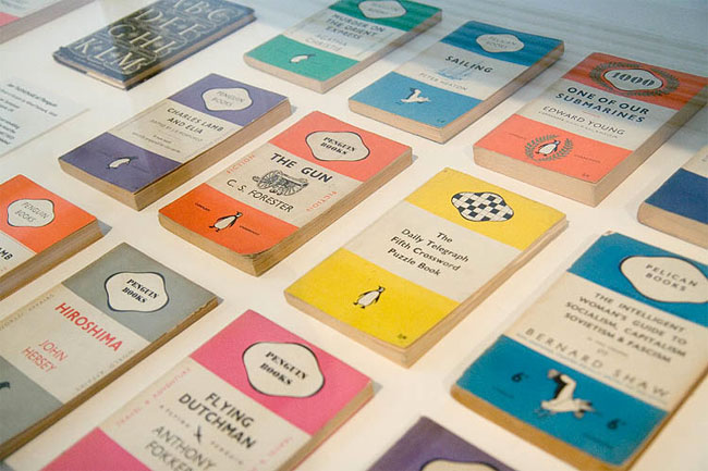
If the point of a brand mark is to guarantee quality, then Penguin excels. My father, a lifelong devotee, describes it as 'my university'. Many share his trust and appreciation. Like holding a Guinness at the bar, one feels part of a select band when reading a Penguin on the Tube or beach. Generations of investment in great design has helped earn this status.

Photo source: James Muspratt (not in Champions of Design book)
The original (Tube map inspired?) system of distinctive coloured stripes met the business strategy; they would have been cheap to produce, compared with myriad cover designs and illustrations. However, we don't want cheap brands. We want great brands cheap. Penguin used good paper, quality binding and typography that allowed the words to breathe. They were designs of hardback quality in soft covers.
This flightless bird has adapted beautifully over the years, radically changing its design approach in response to market forces and trends, from the graphical covers of the 60s, to the commercial designs of today. Penguin achieved coherent change mostly from having a strong in-house design culture. This ethos was not elitist. Edward Young was a 21-year-old office junior when he drew the logo and devised the colour-coding system. A secretary came up with the name.
Luck also plays a part in great brand design. Penguin was still young as World War II erupted, and its format just so happened to prove the perfect fit for a battledress pocket. On such quirks are great brands built.
Written by Silas Amos, a founder designer at jkr in 1990.
—
Each of the 25 case studies includes a brand timeline and "Did you know?" page.
Did you know that in 1989, following Penguin's publication of Salman Rushdie's The Satanic Verses, bombs were planted in a Penguin bookshop in York and in Liberty's in London where the company also had a concession?

Download your free copy of the PDF here on the jkr website.
Somewhat related: Penguin logo guidelines.

No hay comentarios:
Publicar un comentario